Study Case
Microsite Home Loans – FNA
Product Design · Users Research · Information Architecture · Accessibility
Context
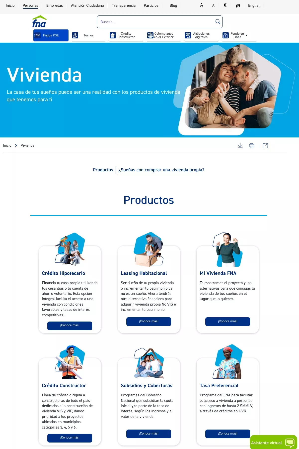
The Colombian National Savings Fund (Fondo Nacional del Ahorro) offers programs to encourage the acquisition of new or used housing and assistance to obtain home loans, focusing on populations with little access to credit such as low income groups, young people, independent workers and single mothers.
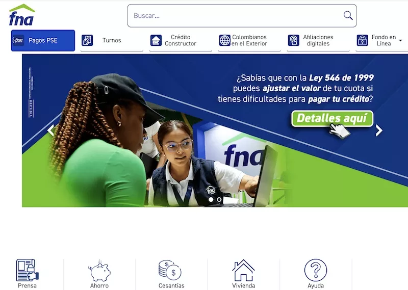
Despite their attractive offer and leading position in the social housing market, with low rates and programs aimed at vulnerable groups, their clients approach them through face-to-face or phone call advice, missing the opportunity to be guided through their web portal.
As a graduation project for my master’s thesis in User-Centered Digital Experiences (UX) at ICESI University in Cali, Colombia, I worked with my colleague Luisa Moncayo on the research and design of a solution for the orientation process of the FNA housing loan services.
Background
The company already had a website that was fed and developed without following the guidelines of the initially proposed UX strategy, which affected the current messy structure.
Additionally, the content was not aligned with the profile of the users it was aimed at, so the language used was very technical and complex.
The Problem
The use of complex financial language, the chaotic navigation architecture, and the weakness of the loans calculator, an essential tool in decision-making, hinder the understanding of the services and benefits offered, thus blocking the membership process.
Goals
1
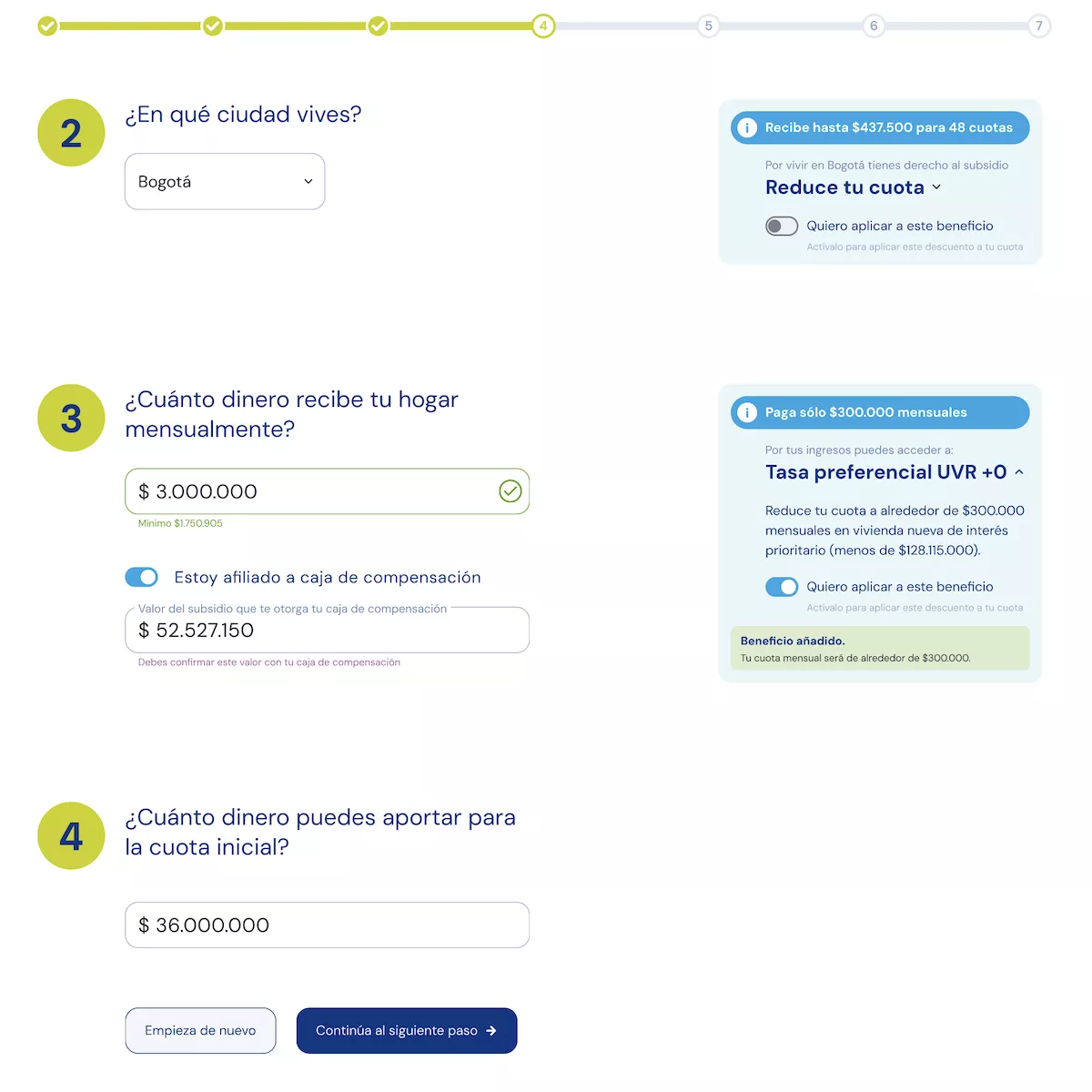
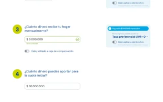
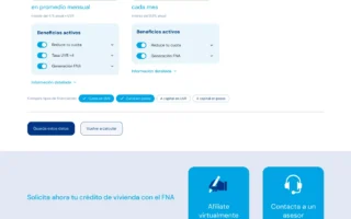
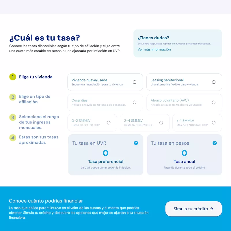
Transform the housing section of the web portal into a Specialized Microsite and redesign the loan calculator.
2
Build a new, simpler structure defined by users’ consultation intentions and not by the services offered.
3
Implement Plain Language in the website content to reduce cognitive load and ensure accessibility and inclusion in information presentation.
The Team
The User
Pain Points
1
The use of financial language is a barrier for users.
2
The complexity of the way the entity’s services are presented generates confusion and boosts dropout in the orientation process.
3
The loan calculator is not aligned with the goals and contexts of the users.
Research
Exploratory interviews
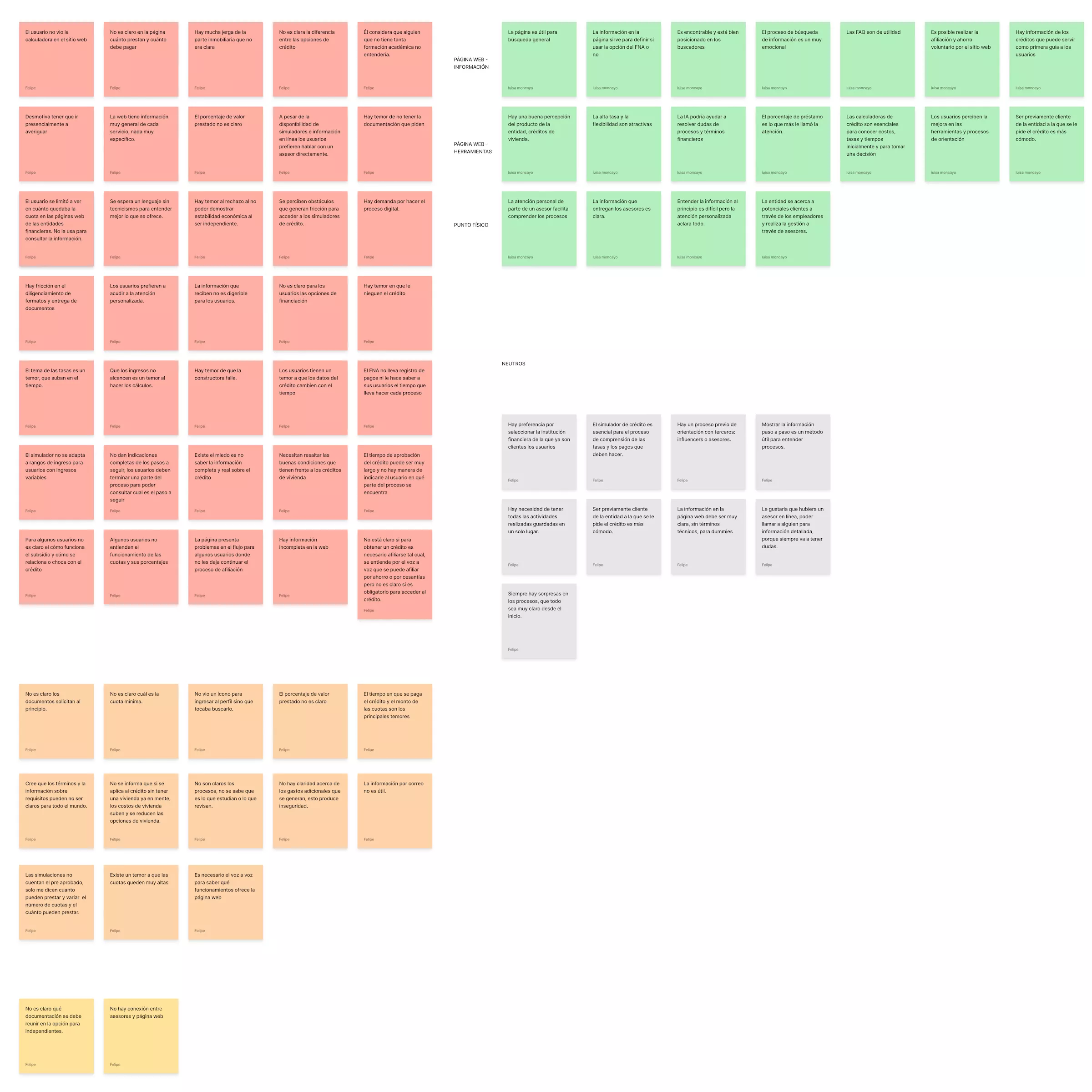
We interviewed interested users and beneficiaries, with whom we confirmed their preference for in-person or telephone advice.
Based on interviews with two stakeholders, we identified that the lack of continuity in the UX strategy implemented on the portal has resulted in inconsistencies in the design system.
Secondary research
Based on the data collected in the inteerviews, we worked with multiple artifacts to frame the problem from the users’ perspective:
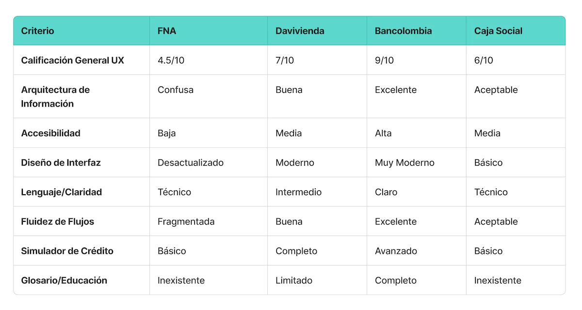
- A benchmarking, with which we verified that the FNA’s online solution is very weak compared to its opponents.
- A desk research, with which we obtained real numbers on penetration, perception and context.
Ethnographic research
To obtain key findings that would allow us to understand user pain points, we conducted the following:
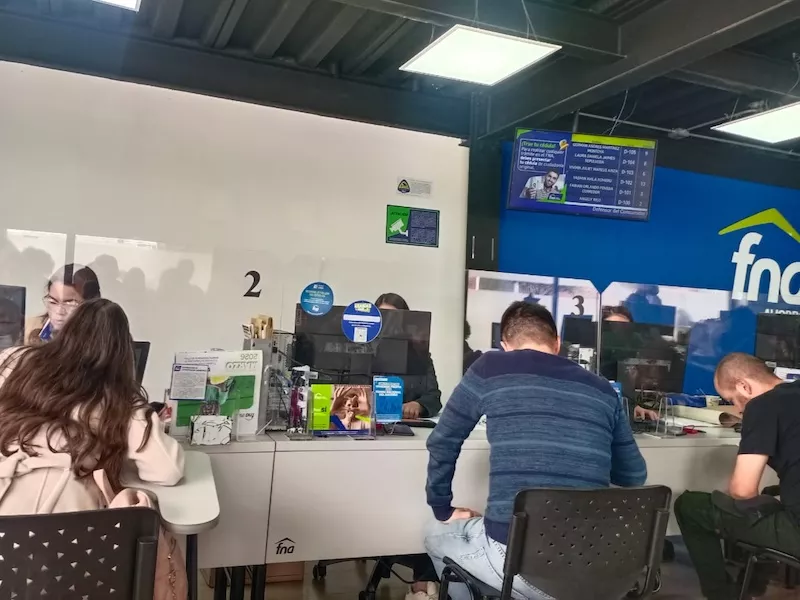
- A mystery shopper where we could see evidence of the saturation of physical channels.
- A Safari investigation that revealed the dependence on advisors for information.
Product evaluation
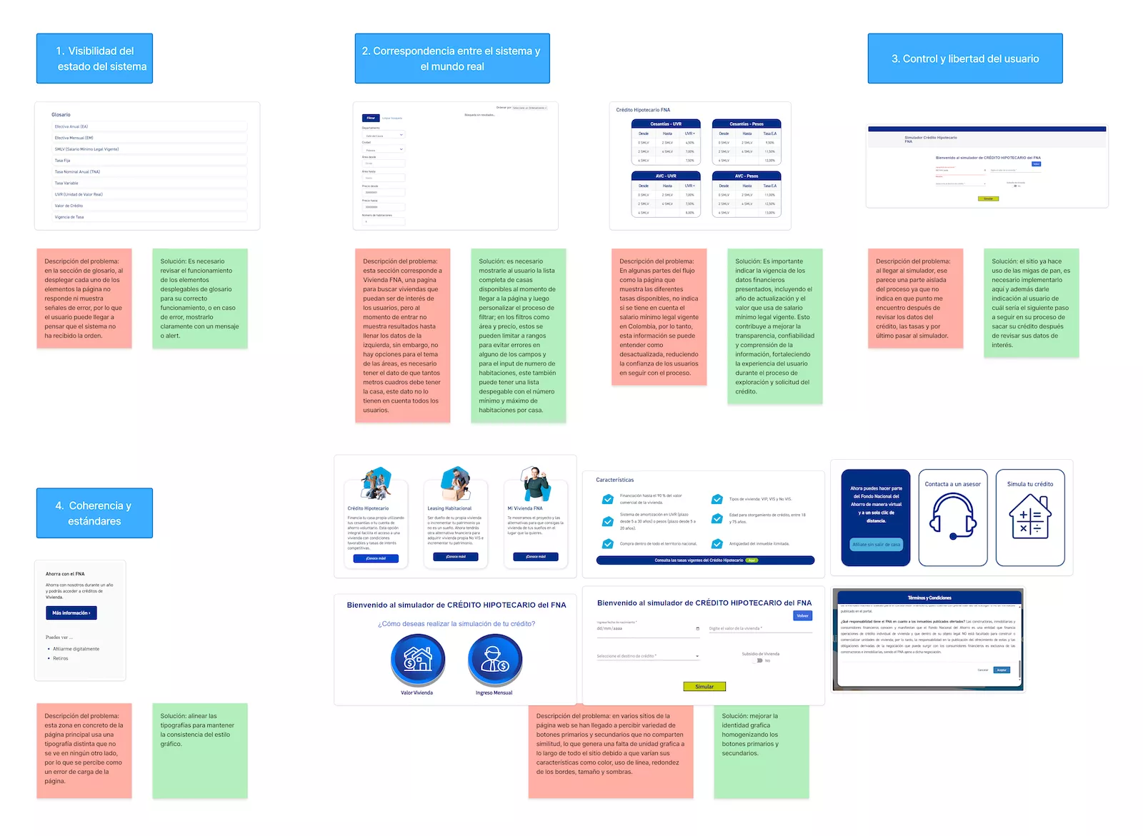
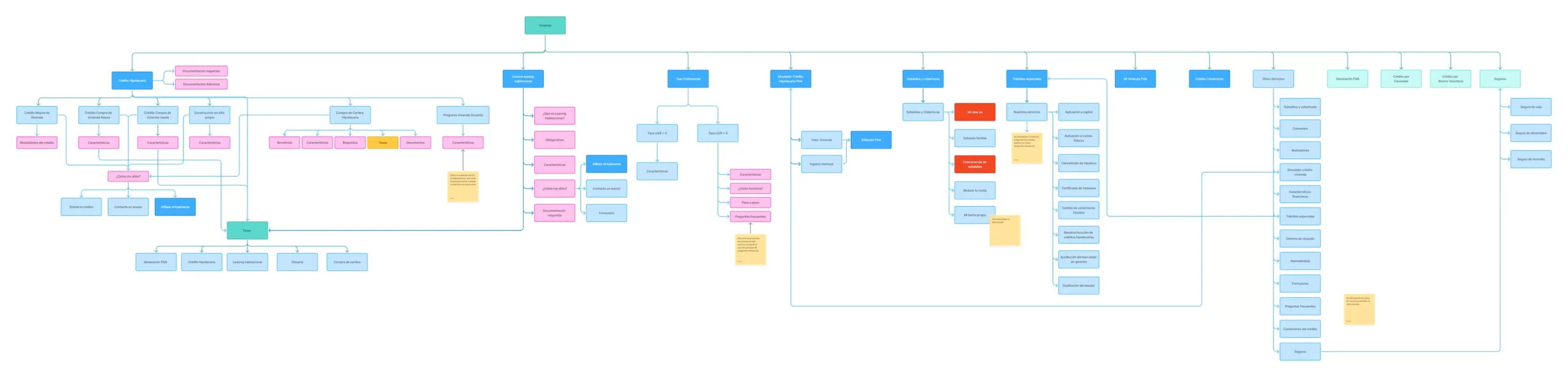
Through a heuristic audit and information architecture analysis, we were able to identify errors and inconsistencies in the interface and structure of the portal.
User persona
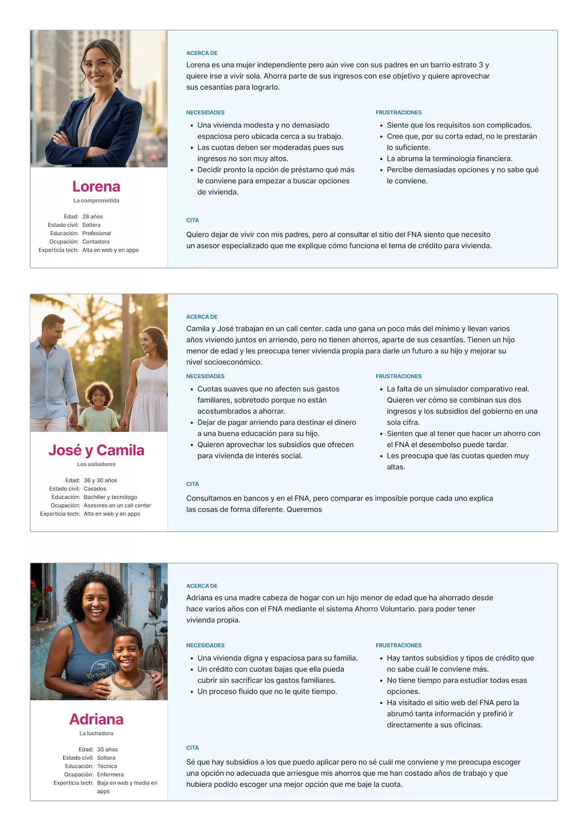
Based on interviews and secondary and ethnographic research methods, we identified 3 archetypes:
- The committed young person under 28 who starts saving,
- The dreamers, couples looking to stop renting,
- The fighters, single mothers who want to give their children a better quality of life.
Journey map
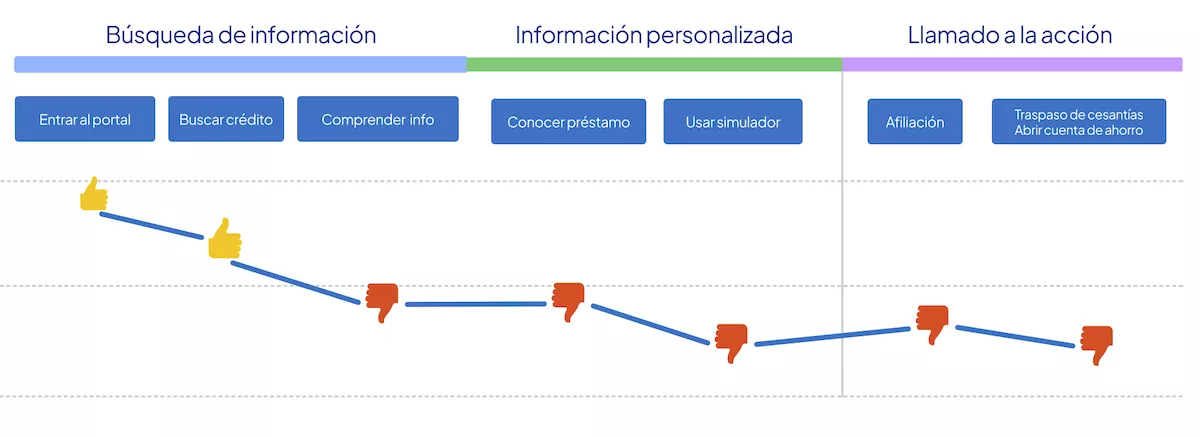
We evaluate the user journey from the moment they enter the website with motivation and optimism, until they start to experience difficulties trying to find clear information. They use the calculator, but upon obtaining results with complex information, they interrupt the process and decide to seek in-person consultation.
Insights
As a result of the findings gathered using all these research methods, we found that:
1
The website is disconnected from the originally implemented UX strategy.
2
There is no consistent hierarchy, there is too much information presented chaotically, and there is no autonomy to obtain it.
3
The loan calculator is not aligned with the user’s context.
4
Financial language is a barrier for users.
5
Users prefer personalized attention, either in person or by phone.
6
The complexity of the offer generates confusion and insecurity when choosing a loan.
&
Ideation
Based on these insights, we decided to focus on 3 pillars, prioritizing each aspect according to its impact on UX and business objectives:
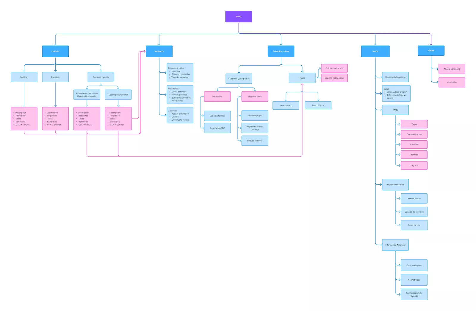
Information Architecture
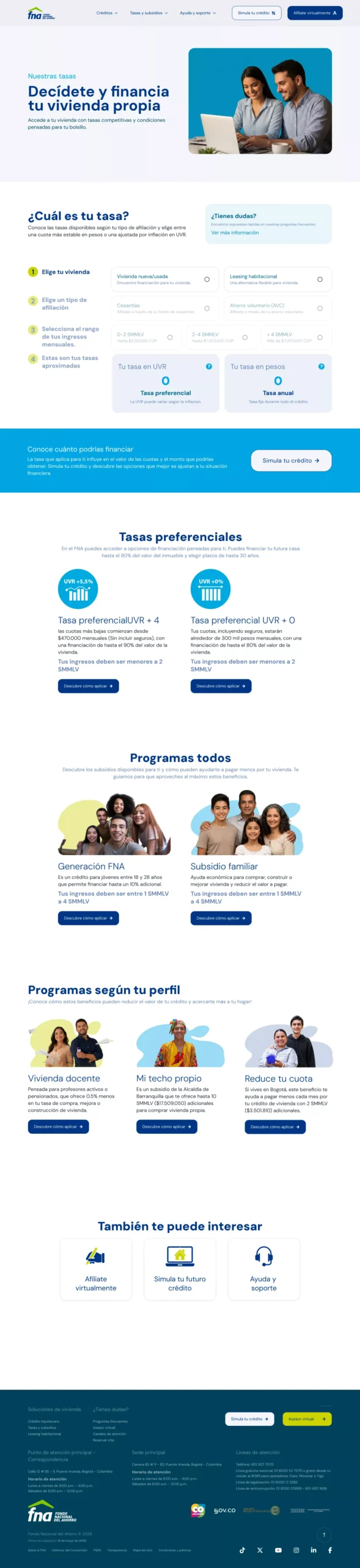
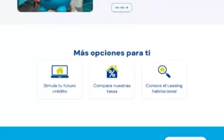
We reorganized the architecture and workflows according to user goals. We prioritized five key areas: loans, calculations, subsidies and rates, assistance, and membership.
User Flow
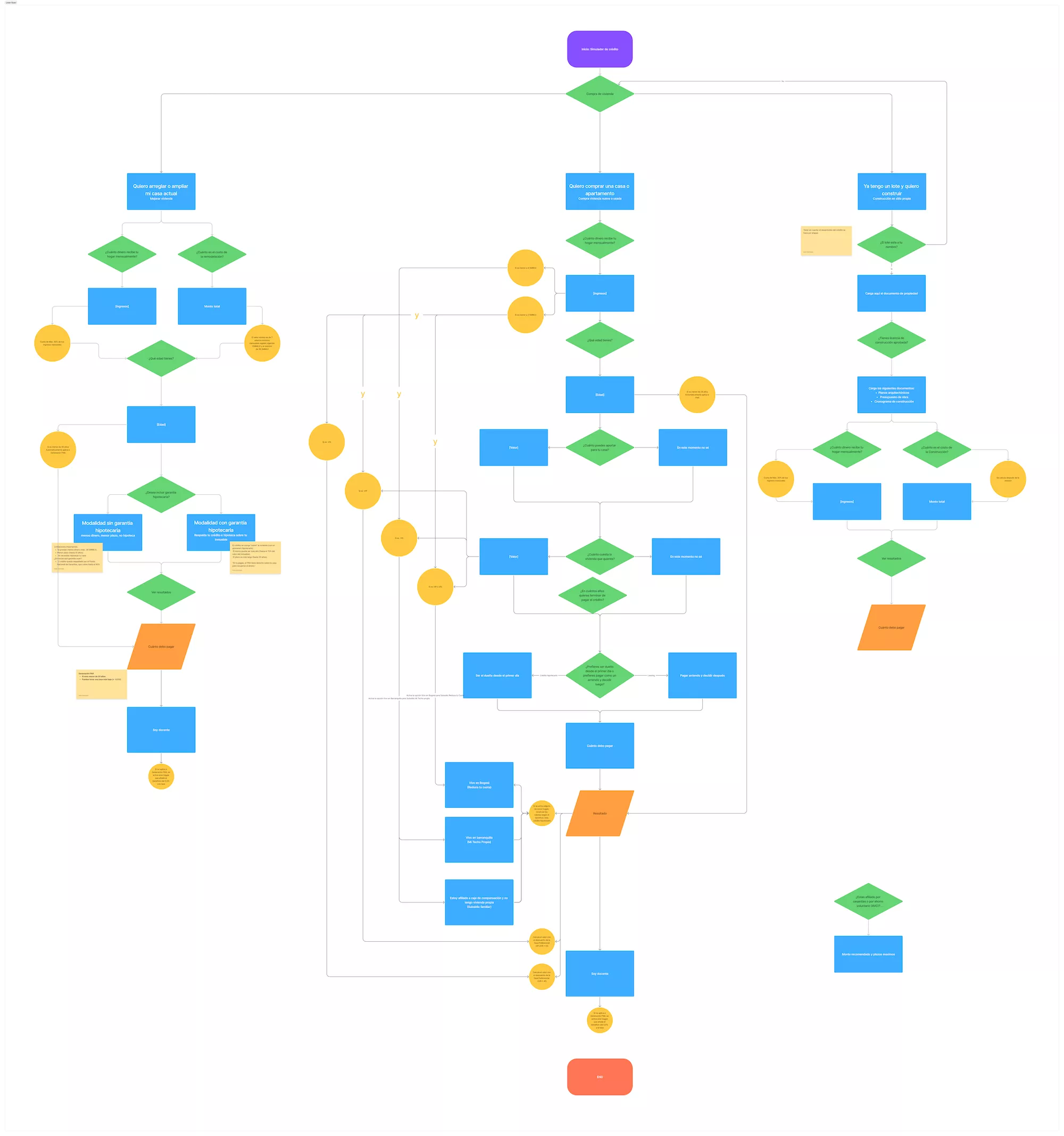
We reorganized user flows for essential tasks, focusing on the paths a person would take who needs to know:
- the types of loans they could take,
- the benefits they can apply for and
- how much they will have to pay monthly according to their financial situation.
UX Writing
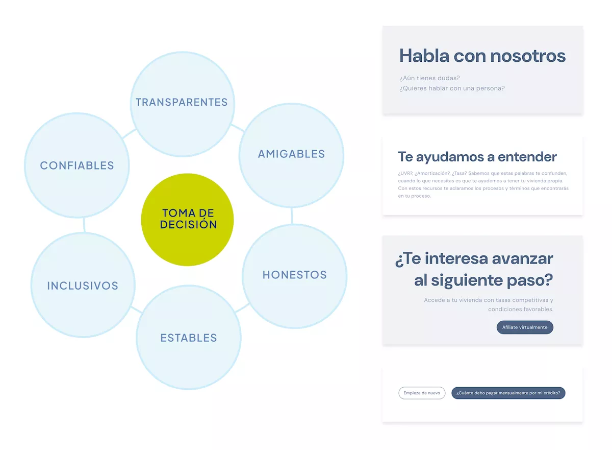
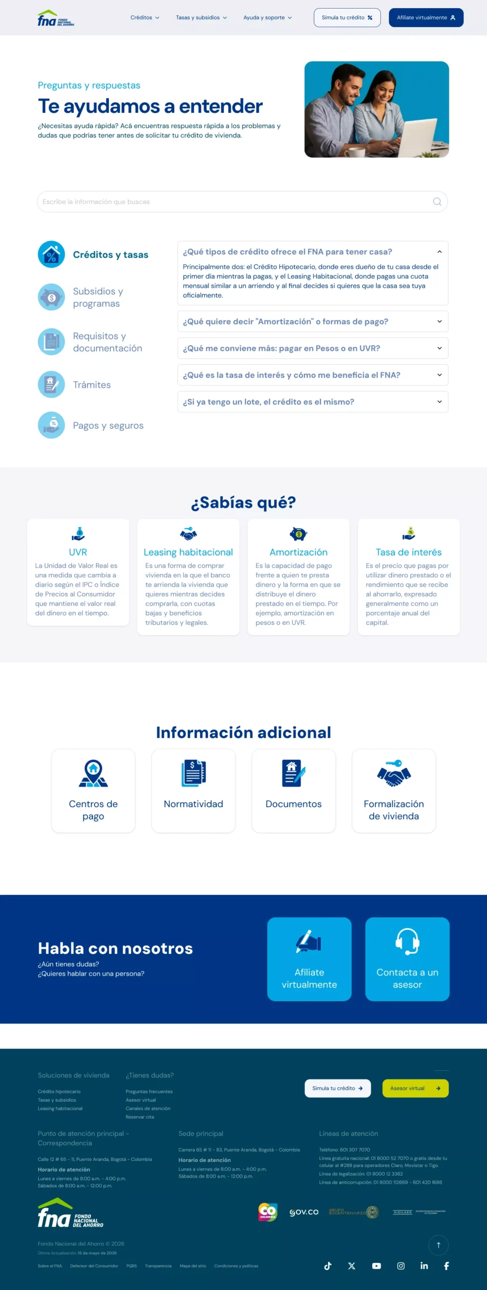
We adapted the voice and tone used in the communication to a Plain language format, and defined a storytelling-type discourse to inform.
- We used straightforward titles and short paragraphs to avoid eye strain and cognitive load.
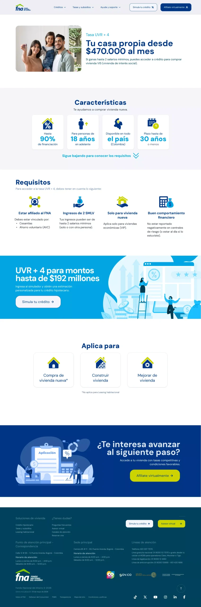
- We divided the information that explains processes into fragments that are presented as numbered steps to make clear where the user is.
- We avoided using complex financial terms and replaced them with words familiar to the user with low financial literacy.
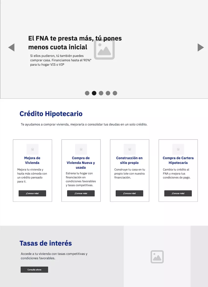
Wireframes
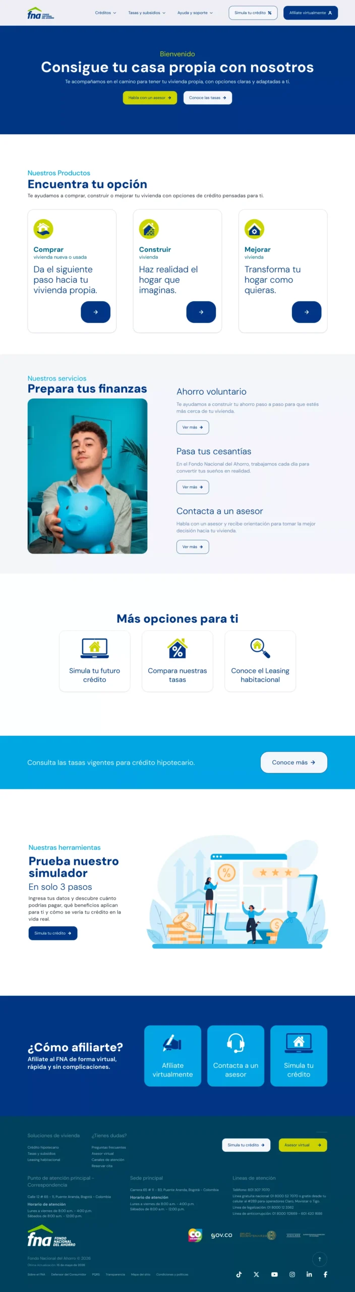
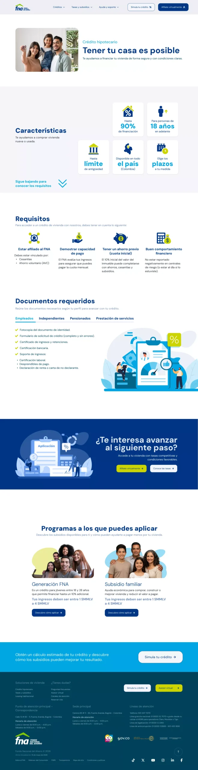
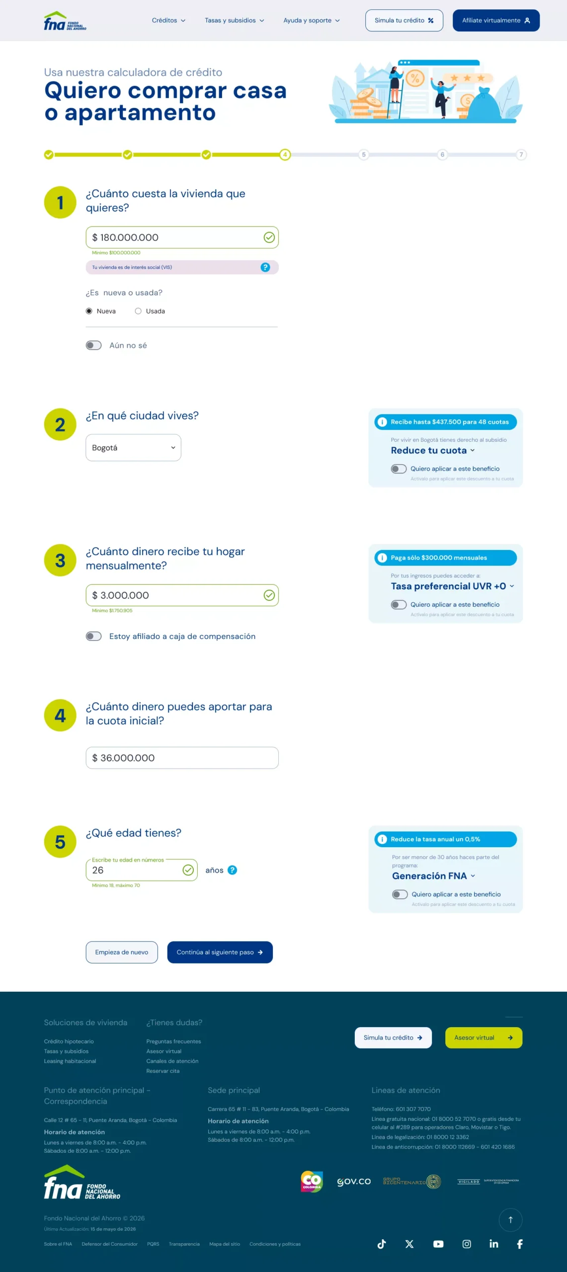
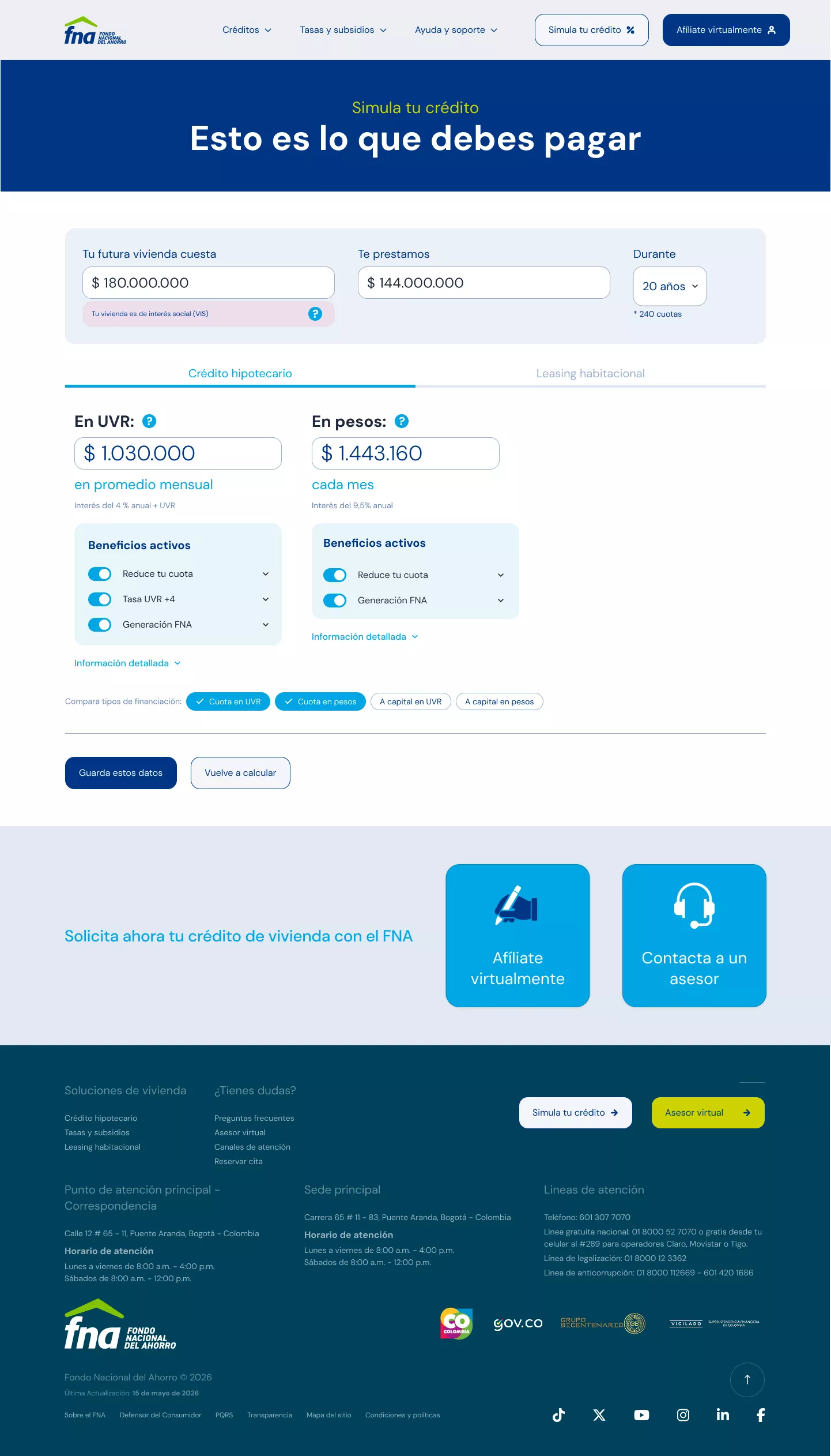
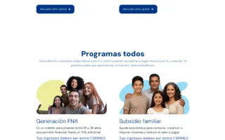
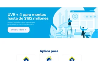
We translated the elements and structures defined in the information architecture, the user flows and the defined language into initial wireframes for the loans calculator and mortgage loan information, which served as a basis for starting the design process and implementing a low-resolution prototype.
&
Design Process
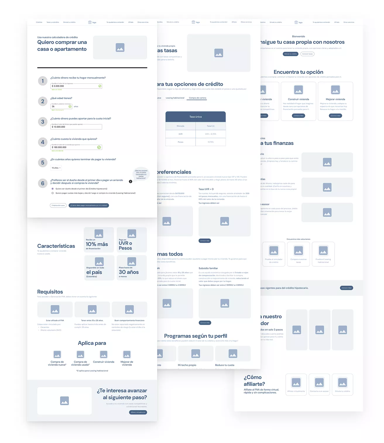
Low fidelity Pprototype
Starting with basic wireframes of the credits page and the loans calculator, a first low-resolution prototype was created to perform early tests and discard or validate elements and functionalities in order to iterate quickly.
Early tests
We conducted early user tests in which we defined tasks focused on searching for information about housing loans, subsidies, rates and guidance, and on the experience of using the calculator.
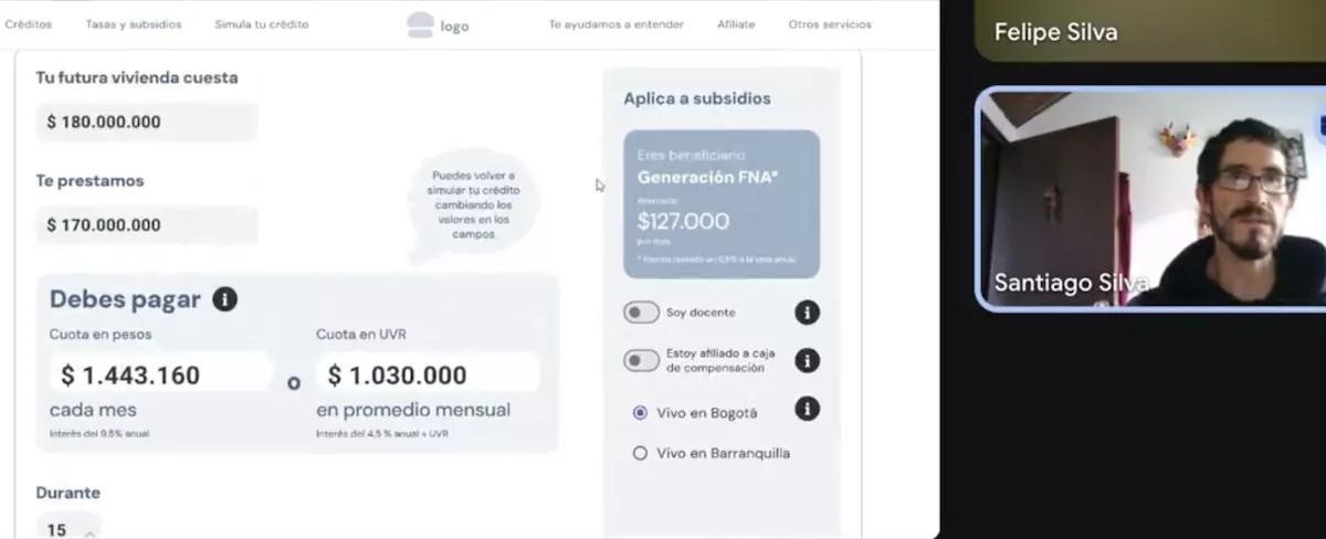
High fidelity prototype
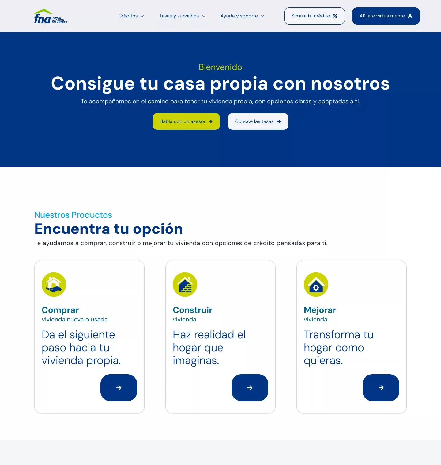
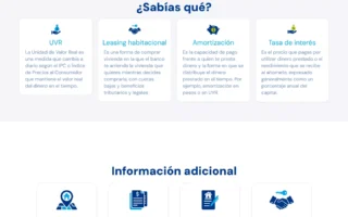
To implement this prototype, we created a design system that we applied to the elements already suggested in the low-resolution prototype, and the elements and components were standardized following the parameters established in the UI design principles.
User tests
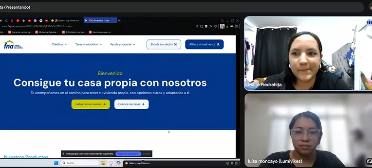
With the prototype fully defined, we conducted tests with 12 users with diverse profiles and digital experience levels who were unfamiliar with the project. Tasks were assigned based on the most relevant types of information within a user’s experience and the proposed sections and functionalities:
- Find information and requirements about mortgage loans.
- Consult and generate a personalized rate.
- Check subsidies and benefits.
- Go through the complete credit simulation flow.
- Search for additional information on relevant topics.
Evaluation of results
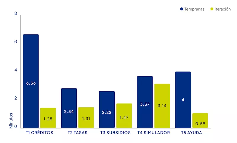
By comparing the results between both tests, we managed to drastically reduce response times in all tasks, standing out the times for consulting credit information and additional information.
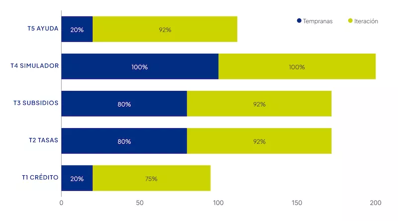
For those same tasks, the success rate improved substantially.
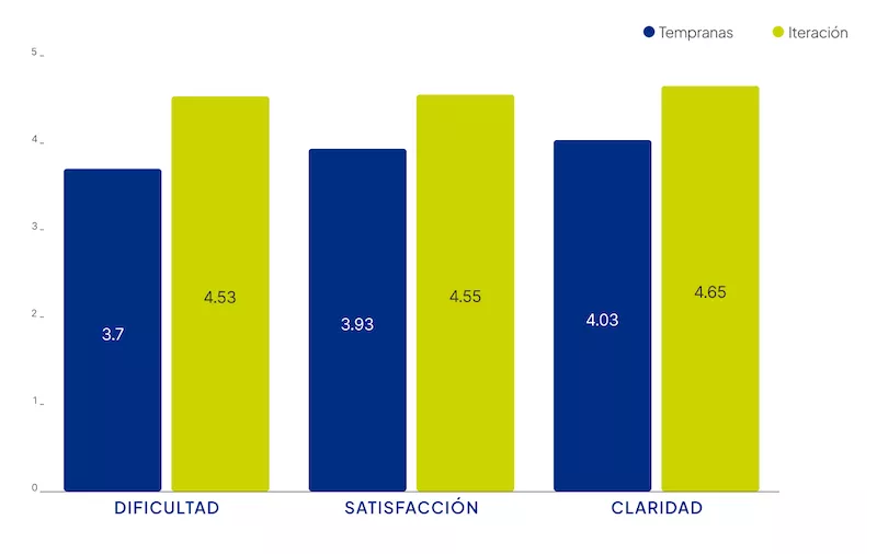
Average qualitative metrics showed improvement in all tasks: going from values between 3.7 and 4 to ratings above 4.5/5, both in perceived difficulty, level of satisfaction and clarity in the language used.
&
Final prototypes

Conclusions
Impact
Learnings
- A good distribution of efforts from the beginning of the project, focused on the strengths of the team members, facilitates the fluidity of the research and design processes.
- Defining a detailed roadmap, with set dates for each stage and responsibles for each task, accompanied by a live backlog that is fed and updated according to the progress and findings or new challenges of each stage, allows for clarity on the status of the project and helps to make it dynamic and organized.
- Using multiple research methods enriches the results and strengthens the proposal being developed.